
Flow
We start with a visualization of all 13,208 images shared by 6,165 Instagram users in central part of Kyiv during February 17-22, 2014. The images are organized by shared date/time, top to bottom and left to right. (We have added time stamps to each image - they are not part of normal Instagram interface. We also added 6 hr time intervals, and very short summary of the events that took place every day).
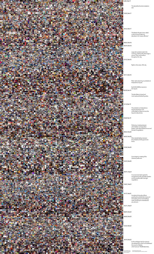
If you click on the image, it will take you to the high resolution version and you can examine the details, comparing the summary of the events from Wikipedia with the Instagram image steeam. But looking at the visualization at the smaller size (above) allows us to notice the larger visual patterns. Six light-to-dark “waves” correspond to the six days (lighter images during the day, darker images at night). From this bird’s eye view, we don’t see any obvious reflections of the exceptional events that took place during this period. It seems as though the Revolution never took place.
Below are the two closeups. The first closeup show parts of late evening of February 18 (the attack of goverment forces on Maidan). The second shows parts of the morning of February 19.
 |
| From The Everyday Project |
 |
| From The Everyday Project |
Looking at this scale, we now see photos of the events at Independence Square (for examples, fires and crowds of people and an Ukrainian flag in the first closeup) next to the photos showing other subjects. But how much of the exceptional we see depends on what part of the visualization we zoom into. Look at the second closeup which shows the morning after the attacks. It also has a few images related to the events the previous night, but you have to look more closely to notice them.
Time
Now we will visualize the same data as a graph, plotting the number of images shared during February 17-22 (left to right).
Each “hill” corresponds to one 24-hour period. Grey area shows the numbers of all shared images. Red area shows the numbers of images shared around Independence Square - 1,900 images, or %14 of the total.
 |
| From The Everyday: 144 Hours in Kyiv |
If we look at the grey part of the graph, all the days are quite similar – few images in early morning, more in the afternoon, and then gradual decrease in the evening. The last day in our period (February 22) is somewhat different probably because it is Saturday, so people are waking up later and going out later as well. Again, looking only at the volume of all shared images, you would not know that a revolution took place.
Filtering the data to select only images shared around Independence Square (red area) tells a different story. There is almost nothing on the first day before the events start (2/17). The next day there are confrontations between the protestors and government forces in a few areas (2/18). Police stages a big attack on Independence Square at 8 pm, and it continues for hours. In the graph, we see a big jump already around 6pm. The next day there is no fighting on the square, but more people are arriving on the square in preparation for the next fight, and many also coming to see and take photos with their phones (2/19). This high level of activity continues for the rest of our selected period.
Space
Having separated time into two streams – everything shared in the central part of Kyiv and images shared around the area of Independence Square – we made the exceptional clearly visible. We also revealed its temporal shape (red part of the graph above).
We will now switch from time to space, and map the locations of images. The first map below displays locations of images shared during the day before confrontations start (February 17). The second map shows locations of images shared during next five days, i.e. February 18-22. (Note that since our collection was limited to a rectangle centered on Independence Square, there are no points outside of this rectangle).
 |
| From The Everyday: 144 Hours in Kyiv |
 |
| From The Everyday: 144 Hours in Kyiv |
There is no spike in activity on Independence Square during February 17th, but over next five days the exceptional – the fights taking place around the square, and the massive meetings there afterwards – clearly stand out.
We can also “slice” these map across a single coordinate (latitude or longitude). The graphs below show volume of shared images (vertical axis) against latitude coordinate (horizontal axis) for February 17 (left graph) and February 18-22 (right graph).
 |
| From The Everyday Project |
The story told by these maps and slices is similar to what we saw in time plot above – but now the exceptional stands out more dramatically. For example, while on the map slice for February 17 Independence Square is just a part of overall busy activity in the city center, during next five days it completely dominates all other areas.
What is #euromaidan?
Our images have seven different Maidan tags, spelling the word differently in English, Russian and Ukrainian. Each of these tags potentially has different meanings for people who use them.
These tags are: #майдан, #maidan, #euromaidan, #євромайдан, #евромайдан, #euromaydan, #Euromaidan.
Overall, 1,340 images have at least one of these tags (%10 of the total).
We visualize these images organized by upload date and time (left to right, top to bottom).
 |
| From The Everyday: 144 Hours in Kyiv |
Zooming into this visualization we discover that while most of the images with Maidan tags are indeed directly related to Maidan events, a few are not (for an example, a selfie in column 1, row 4):
 |
| From The Everyday Project |
We also visualized the images that do not have any Maidan tags, and discovered that occasionally they show the events on the square. And when we examined the images shared around the square, we found that some of them have no obvious relation to Maidan events. So we cannot exclusively rely on tags to understand the subjects of images. For a computer scientist concerned with detecting social upheavals in social media, this finding would indicate a problem that needs to be solved. Such images may be considered as “noise,” only to be removed from the “signal.” But for us, they are the real “finding.” They show that the everyday and the exceptional do not simply “co-exists” side-by-side (as presented in the very first visualization above). Instead, they “leak” into each other, so to speak.
This “leakage” has its own patterns. Out of 1,340 images that have one or more Maidan tags, %30 also have some other tag(s). Images with only Maidan tags typically refer to Maidan events. But if an image also has other tags, there is a chance that it shows something else (such as the selfie in the second row of the close-up view).
To conclude this section, here are some of the images with Maidan tags which do not have any obvious connection to the EuroMaidan events:
 |
| From The Everyday Project |
“Speaking the images”
When a person assigns multiple tags to a single image, this image multiplies - because it will now show up in searches for any of these tags. For example, let’s say an image has #euromaidan tag and also #майдан tag. If you use Instagram to search for these tags, this image will show up in both results.
When a person uses multiple Maidan tags for the same image, every tag potentially says something else. “Maidan” spelled in English, in Ukrainian, or in Russian is not the same thing. So the reason behind using more than one tag is not only to have wider dissemination of images, or to address different linguistic communities. Assigning a new tag to an image is like saying something else about this image.
Our next visualization is based on this idea. Like the previous visualization, it shows all images that have one or more Maidan tags, but now every image is repeated for each of its Maidan tags. For example, if an image has #euromaidan and #майдан tags, its repeated twice. As a result, 1,340 images turn into 2,917. (The images are organized by date and time (left to right, top to bottom).
 |
| From The Everyday: 144 Hours in Kyiv |
Here is a closeup view of this visualization:
 |
| From The Everyday Project |
Clusters
The kinds of tags applied by users and their frequency often can tell us what images represent, but they also can be misleading. But even if the tags match perfectly, they usually do not completely describe everything an image represents, and how it represents it (composition, focus, etc.). If it is true that “an image equals a thousand words,” we certainly are out of luck - no single Instagram image in our dataset has as many tags.
Let’s take an Instagram photo of a person as an example. The tags can tell us about the gender of a person (#girl, #guy), her or his mood (#happy), and perhaps location (#beach) - but not about the composition, or colors, or all other visual dimensions.
For the next stage of the analysis, we will bypass language. Instead, we will use computer algorithms to automatically separate images into groups based only on visual similarity. Each group contains some images that have something in common. In our use of this popular data analysis technique (called cluster analysis) a computer does not know anything about the content of the images, and only uses their visual characteristics.
We used this data analysis technique to divide all images into 60 clusters. A few of these clusters consist from mostly Maidan related images; most others are not. What they do is reveal the types of “everyday” in Kyiv as it presented on Instagram: double portraits, objects against a white background, city views with light sky and darker lower parts, etc.
Below are three examples of these clusters. The first cluster contains mostly city views with light sky and darker lower part:

The second cluster has many images consisting from graphics or text, or images showing objects against white background:

The images in the third cluster show a single subject in the center framed by light background. These examples illustrate how a large image collection may contain groups of visually similar images that are not visible through direct examination of a collection. While we can notice separate instances of types of images shown in these clusters, it is much harder to see how many such instances a collection contains.

Clustering image by their visual characteristics allows us to relate the exceptional and the everyday in yet another way. Each cluster above contains mostly images of the everyday. But because of the similarity in composition, the clusters also “catch” a few Maidan-related images. In the first cluster, these are the landscapes manipulated to only contain blue and yellow colors of Ukraine flag. In the third cluster, this is a political text situated in front of a candle (second to last row, first and second image from the left).
Tags
Instagram users assigned 5845 unique tags to images they shared in the larger central area of Kyiv during February 17-22. These tags were applied 21,465 times.
If we analyze these tags, would this tell us the same story as the previous graphs and visualizations, or a different one?
The following table shows top 10 tags for each of the six days, sorted from top to bottom in order of their frequency.
 |
On the first day (February 17) before confrontations start, we see typical Instagram pattern common to numerous places around the world. The geographic tags which identify the location appear first, followed by “universal” Instagram tags not specific to any location: #love, #follow, followme, #instagood, #me, #photooftheday. These tags are among top 15 tags on Instagram around the world on a daily basis (To see the top 100 Instagram tags on any given day, consult http://websta.me/hot/.)
As confrontations begin, the words “EuroMaidan,” “Maidan” and “revolution” immediately jump to the top. On February 18, only two universal Instagram tags still make it to the bottom of the top ten ranking (#love and #followme). February 19 is truly exceptional: no generic Instagram tags are in the list. And on February 20 and 21, only single generic tag #love appears in the bottom. Finally, on the 22nd, as the fighting is over and the revolution has succeeded, two generic tags slip back in (#followme and #instagood).
Overall, we get a perfect arc. Before the exeptional events, “the Instagram everyday” dominates the list (February 17th). then it disappears completely (19th), and after that gradually starts coming back (20th-22nd). The exceptional local events push out the universal everyday - but only for a short time.
 |
| From The Everyday Project |
The pattern is remarkably clear, but it raises a question. The proportion of images shared around Indepedence Square is only %14 of all 13,208 images shared in the larger central part of Kyiv. But when we consider the tags of all these images, Maidan tags dominate during the revolution days. Why? One reasonable explanation is that people who did not come to Maidan were still concerned with the events, and they used Maidan tags to show their support of (or other attitudes towards) the revolution.
To see even more clearly how strong the "eruption" of the local is in Kyiv tags during February 18-21, 2014, we can compare it with top tags in other cities. The following table shows 5 top tags in five cities during one week (December 5-11, 2013). Each city is represented by 20,000 images sampled from all images shared in the central part of that city during that week. The collected areas were the same in size as what we used later for Kyiv. (We downloaded these images from Instagram for our Selfiecity project).

The linguistic similarity between Instagram versions of these cites in remarkable. Practically the same set of tags is repeated, with only small differences in their positions between the cities. The only exception is the tag #thaiuprizing in Bangkok, and one tag in Russian in Moscow, identifying the city name.
Users
Plotting numbers of tags vs. numbers of users paints a particularly fascinating pattern of how the exceptional and the everyday interact during our selected six days. In the following plot, the top tags are arranged verticaly in descending order. The horizontal axis shows how many people used each tag. (To make the graph readable, we used log scale and also added random jitter to the points. Here are is the original graph that uses normal scale.)
 |
| From The Everyday: 144 Hours in Kyiv |
Most tags lie on a straight line, indicating a logical relationship: if more people use a particular tag, its overall frequency goes up. What is interesting to examine are the tags which lie outside of this general trend.
In the top right corner, we find #майдан ("Maidan" spelled in cyrillic - the script used both by Ukrainian and Russian languages). It is the most frequent tag during the six day period. But now take a look at the group of tags in lower left corner: #ballet, #balletomania, #ballerina and a few others. Apparently, some ballet event took place during the revolution days.
These tags lie outside of the trend line because they were all contributed by a single Instagram user. Tagging over 40 photos with #ballet alone, this user upsets the perfect pattern. Judging from this graph, what was really exceptional was this ballet event, rather than Maidan happenings. This is a good example of how social media can "capture" highly personal "realities" which may exist in parallel to what others consider to be important.
Languages
The seven Maidan tags appearing alongside Instagram images cover three languages:
#maidan (English)
#euromaidan (English)
#euromaydan (English)
#Euromaidan (English)
#майдан (can be Ukrainian or Russian)
#євромайдан (Ukrainian)
#евромайдан (Russian)
People typically assign more than one Maidan tag to the same image. The following list quantifies this (only Maidan tags are being counted):
338 images have one tag
610 images have two tags
80 images have three tags
219 images have four tags
64 images have five tags
6 images have six tags
Since these tags can be in three languages, what can we learn by studying what tags people use together? In the "matrix" plot below, the intensity of blur color indicates how frequently the two tags occur together. (Since the diagonal in such a plot corresponds to each tag "occurring" with each other, we always get darkest circles there.)
 |
| From The Everyday Project |
Most intersections of tags have some degree of blue, indicating that these tags were used together on a number of occasions. The same is true for the three languages. All combinations of English, Ukrainian and Russian were used, without one pair or one language dominating over others.
Since we are looking at languages, we can also go back to our table showing top 10 tags for each of six days, and plot the same data in terms of three languages:
 |
| From The Everyday Project |

The dominance of English is not surprising - but why do we see almost as many tags in Russian as in Ukrainian (English: 2553; Ukrainian: 637; Russian: 598.) This pattern reflects the use of these languages in everyday life in Ukraine. In the 2003 survey, when the question 'What language do you use in everyday life?' was asked in Kyiv, 52% said 'mostly Russian', 32% 'both Russian and Ukrainian in equal measure', 14% 'mostly Ukrainian', and 4.3% 'exclusively Ukrainian'. According to a 2006 survey, 52% use Russian at home, 23% use Ukrainian and 24% switch between both
(http://en.wikipedia.org/wiki/Kiev#Demographics).
Therefore, the use of Russian vs. Ukrainian tags does not stand for pro-Russian vs pro-Ukrainian views. And the high proportion of Russian tags does not mean that most Instagram users in Kyiv were supporters of pro-Russian policies. Instead, since the majority of tags are in English, we can assume that many of the people posting on Instagram in Kyiv are West oriented and more global in their outlook than some other Ukrainian citizens.